Discovering the Doughnut
After reading Less is More by Jason Hickel on the concept of degrowth, I was left with a mental void. I understood the flaw in building a world on perpetual growth, but I couldn’t see a solution that didn’t require completely dismantling the modern world order.
I mean… we live in a capitalistic world for nearly 500 years now. Communism hasn’t worked out either. So what else is there?
ChatGPT suggested a follow-up book called “The Doughnut Economics”. I ordered it immediately. I hadn’t even made it far into the first chapter when, on page 44, I found myself dumbfounded.
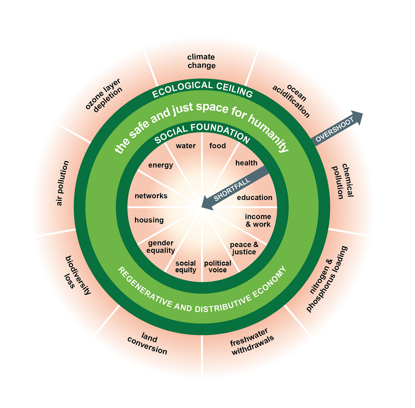
Never thought it was possible to visualize all of world’s problems in a single graphic. Yet there it was.
They call it “The Doughnut”, even though I think “The Ring” would have been the better name. Doughnuts are unhealthy, overly sweet and obesity-causing products. On the other hand, imagine all the Lord of The Ring references we could have made!
Anyway, it was developed by Kate Raworth in 2012 and published in her Oxfam paper A Safe and Just Space for Humanity.

It’s essentially a global-scale compass for social and planetary balance. It visualizes a “sweet spot” — the green area — where we meet everyone’s needs (social foundation) without overshooting Earth’s environmental limits (ecological ceiling).
I spent hours staring and reflecting on it.
Is that even possible?
How do you re-design the world to be within the doughnut?
What are the areas of the doughnut that need most attention?
It was time to debug!
Digesting the doughnut
One reason I love this illustration so much is that it not only captures the world’s major challenges — it also hints at the solution: we need to stay within the donughnut.
It’s an incredibly challenging and complex task, as most of these dimensions are interdependent. Environmental stress can increase poverty. Air pollution affects health. Our energy needs lead to climate change, which leads to biodiversity loss. It’s all connected.
Solving it requires moderation, balance and system thinking. Taking multiple considerations into account. We’ve seen what happens when we “move fast and break things”.
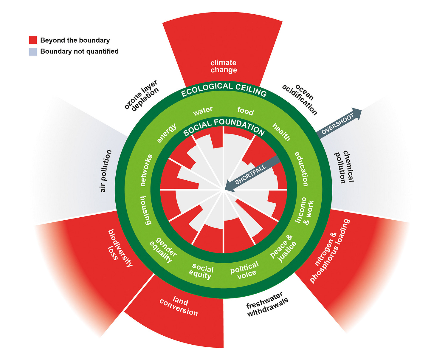
The best way to grasp the scale of this challenge is to look at the graphic a few pages later:

Unsurprisingly, it’s not looking great.
We’re overshooting ecological boundaries in multiple areas while falling short on every single social dimension.
While I absolutely love this illustration, I have one issue: it’s outdated.
It was published in 2017 using data from 2005–2009 — that’s nearly 20 years ago!
When I couldn’t find a more recent version, I decided to create one myself.
Updating the doughnut
Kate Raworth’s original paper came out in 2012 — and a lot has changed since then.
The Sustainable Development Goals (SDGs) were adopted in 2015
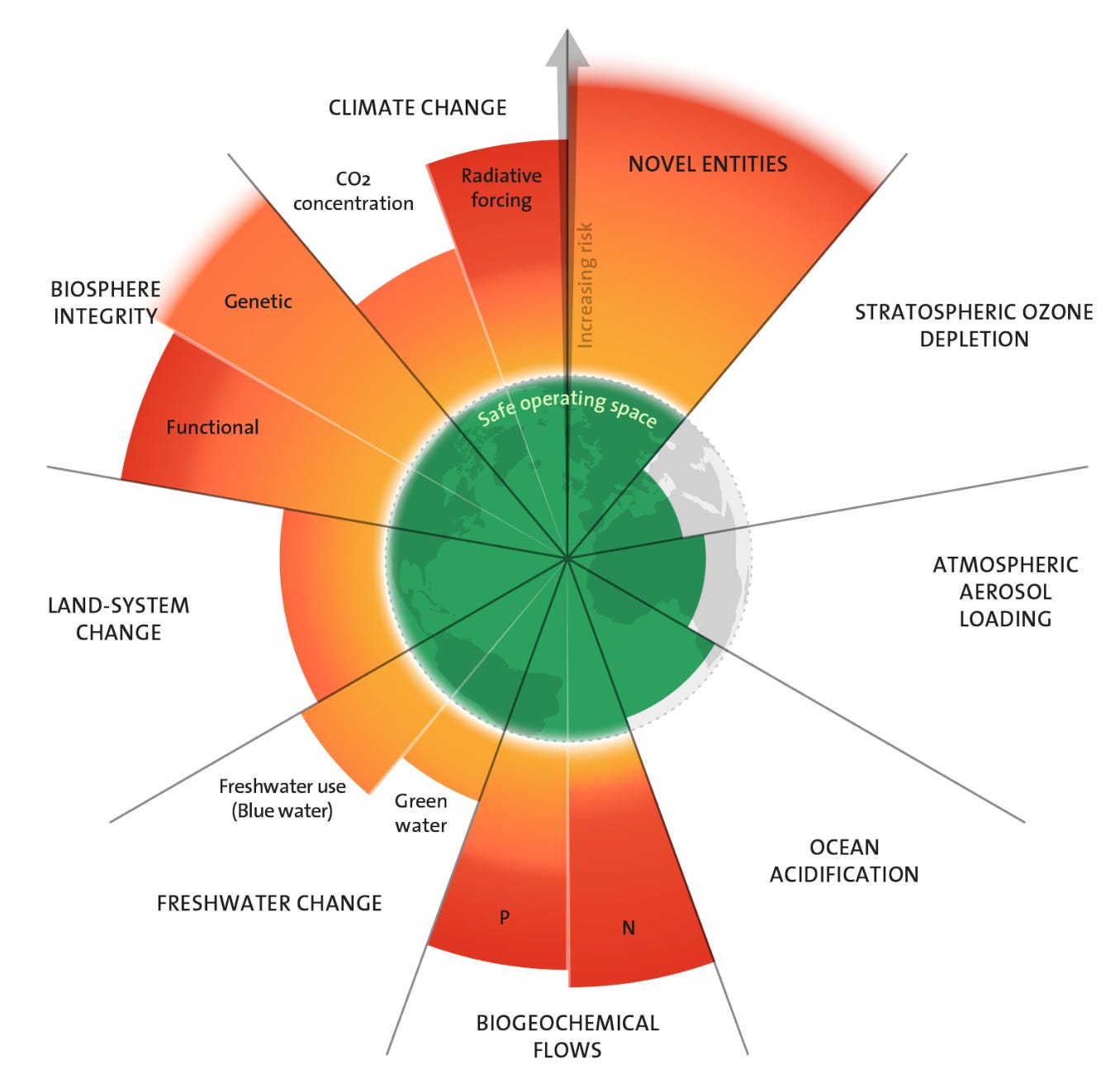
The Planetary Boundaries framework was updated in 2023
After two weeks buried in reports, spreadsheets, and global data portals — I think I’ve got it.
Let’s break it down:
#1: Updating Planetary Boundaries
Since 2012, a team led by Johan Rockström released an updated version of the Planetary Boundaries framework. Their 2023 version shows that we’ve now transgressed 6 out of 9 boundaries, up from 4 in the original Doughnut.

#2: Aligning dimensions and indicators with SDGs
Many original Doughnut categories map well to SDG indicators (e.g. “Food” = “% of population undernourished”), but others needed reinterpretation or fresh metrics.
So I built a table linking each Doughnut dimension to the most representative SDG target and available global metric.
#3: Updating the numbers
You’d think that with all the global tracking, UN data would be consistent and up to date — but that’s sadly not always the case.
Still, I managed to finalize the numbers by triangulating multiple sources and prioritizing consistency and clarity.
#4: Updating the graphic
For the sake of recognizability, I thought to keep the design of the original Planetary Boundaries. In order to use it directly I had to contact its original creators The Stockholm Resilience Centre for permission and thankfully… they said “yes”!
Tens of Photoshop layers later, finally - Here it is!
Download links:
Digesting the doughnut
Okay, so what have we learned? Putting the old illustration and numbers together with the updated one provides an interesting insight into the progress of the last two decades. Let’s start with the good news:
Things that got better
World hunger - 9% of world’s population is undernourished, down from 13% 20 years ago. Even though it’s a significant improvement, it’s still very disheartening to know every 1 in 10 person that walks on this planet, walks hungry. All that while we waste almost 30% of all food produced.
Access to electricity - 9% of the planet lacks access to electricity. That’s a big improvement from 19% in 2009.
Education - 9% of the world is still illiterate, down from 11% in 2009.
The rest of the dimensions either saw very little improvement or got significantly worse.
Things that need more attention
Planetary boundaries - notably due to the fact that our understanding of the boundaries improved significantly in the recent years, we're now transgressing most dimensions. Both chemical pollution, now called "Novel Entities" and "Freshwater Change" saw their boundaries breached by quite a margin. The boundaries that were already transgressed also got worse.
Access to safe water and sanitation - this was probably the biggest shocker for me. 43% of population lacks access to safely managed sanitation and 27% lacks access to safely managed drinking water. In the original doughnut these numbers were much lower: 39% and 13% respectively. The difference can be explained by two factors: better, more accurate data and the changes in the definition of "safe". For example, newer, more granular measurement tools flagged previously uncounted deficiencies—especially contamination exposures like E. coli.
Income - While I was surprised to see the global unemployment numbers to be just at 5%, the problem stems in the inequality of that income. As of 2022, 9% of the world still lives on less that $1.9/day. With that said, the GINI co-efficient has slightly improved both globally and in the developing regions of the world. The number of high inequality countries (gini > 0.4) dropped from 71 to 51 in 2020.
Health - As someone who recently recovered from severe pneumonia, I was surprised to learn that 43.6% of the world lacks coverage of essential health services. The original doughnut reported this to be 30% in 2009. This result can be partially explained by the way the "coverage of essential health services" is defined and measured - it goes beyond proximity to a clinic or hospital. It's a composite index of 14 indicators including: access to vaccinations, skilled birth attendance, availability of treatments for HIV, TB, Malaria, overall hygiene, shortages of staff and even affordability. Falling short on any one or a few of those indicators means you can suddenly be considered "without coverage of essential health services". Having a great modern clinic nearby isn't helpful if you can't afford it or it's short on doctors to treat you.
Most Sustainable Development Goals (SDGs) have a target deadline of 2030. That's in less than 5 years. Even though we've made notable progress in some areas, "End world hunger", "Universal literacy and numeracy", "Universal access to modern energy" doesn't really seem feasible in that timeframe.
And it's not even surprising in any way. Most eyes are on Twitter (not "X"), TikTok and Instagram glorifying short-lived viral content, none of which mentions the problems above. How can you blame anyone? Even I only heard of SDGs and the doughnut just few months ago.
Okay, so what can we do?
Doughnut recipe
The doughnut serves as a high-level compass of what the world would need to start considering to build a safe and just future.
It doesn’t show you how to get there.
Kate Raworth’s book proposes 7 ideas, narrative and focus changes, the “ingredients” of the doughnut:
Change the goal
See the Big Picture
Nurture Human Nature
Get Savvy with Systems
Design to Distribute
Create to Regenerate
Be Agnostic about Growth
We’ll explore these in the next posts.
If you found this topic interesting and would like to follow more similar content, you can subscribe to my Substack at:


Honestly, this should be on the front page of every major news outlet. Why don’t we talk about things like this more?
When you finally see it all laid out, the question changes from what's wrong? to why haven’t we acted?